Back to Our Work

Olive
The Olive App empowers consumers by giving them a clearer vision of their finances with simple, easy-to-use financial planning tools and advice.

Problem
Olive noticed a huge gap in the market for access to a high-quality financial planning service at an affordable price. With a mission to democratise the private banking experience, Olive enlisted Rhapsody’s help in conceptualising an app that enables families to access affordable financial planning support that’s previously only been available to the very wealthy.
Solution
Rhapsody was commissioned to conduct a short 1-week design sprint for Olive Finance, supporting the founder in developing a prototype app and testing the need for better financial planning tools in the consumer market. The sprint process encompassed best-in-class features within a wealth management framework that was focused around better medium- and longer-term planning as well as daily cash flow.

Figma
Results
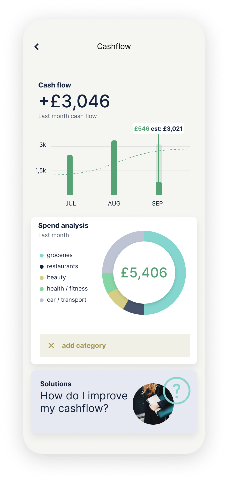
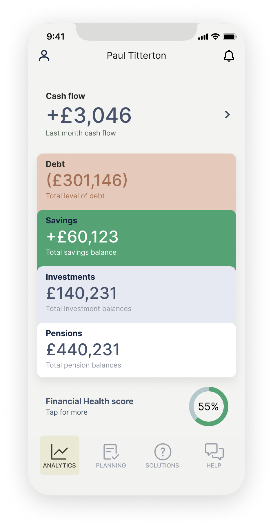
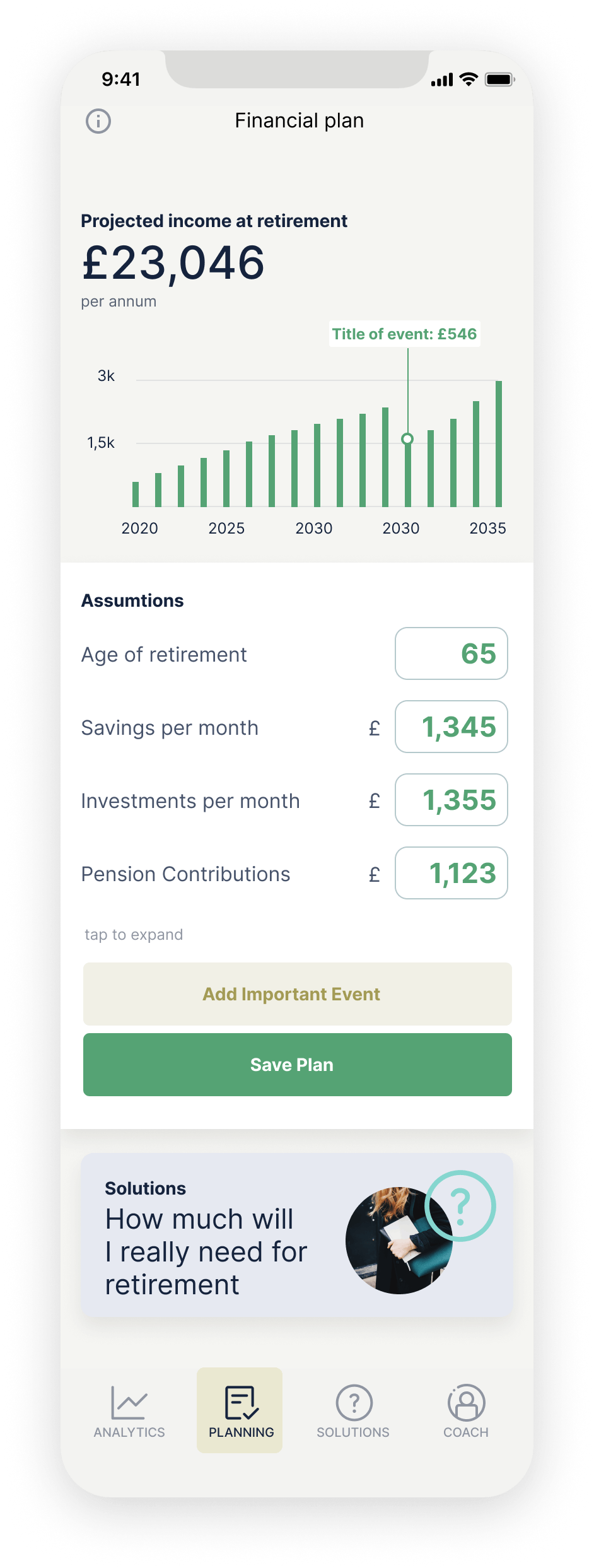
Rhapsody provided a complete designed-and-tested prototype app, and an initial finding of results, ready to present to investors for seed stage funding. This finalised prototype combined straightforward onboarding with Open Banking API, an easy-to-use dashboard with access to cashflow, debt, savings, investments and pension planning, and unique chat/messaging features that gave users access to expert personal money coaches.
Keeping it simple
It was important for users to see a clear breakdown of their cashflow, alongside other various types of spending and saving, without being overwhelmed. To do this, we had to retain all the key data points while keeping a consistent look across every screen. Earthy tones were used to denote different sections within the app and highlight key data from the graphs. This approach helped to bring together a consistent, unified look without one colour overpowering the others.
Attracting the right audience
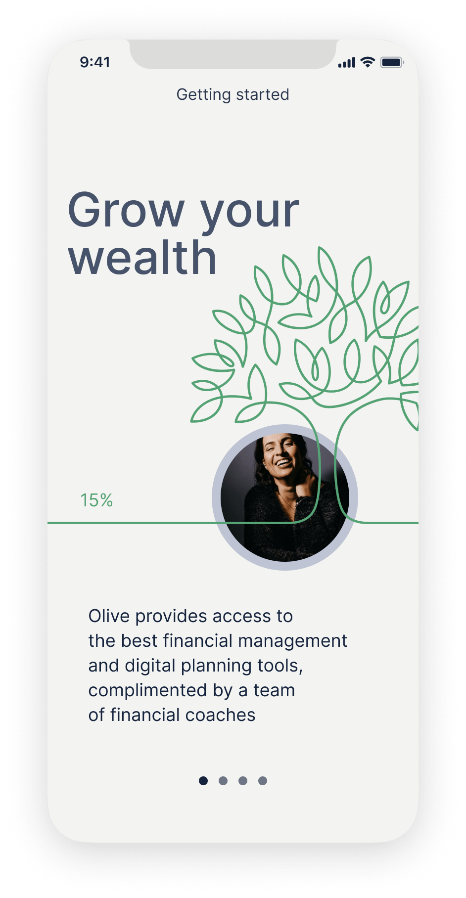
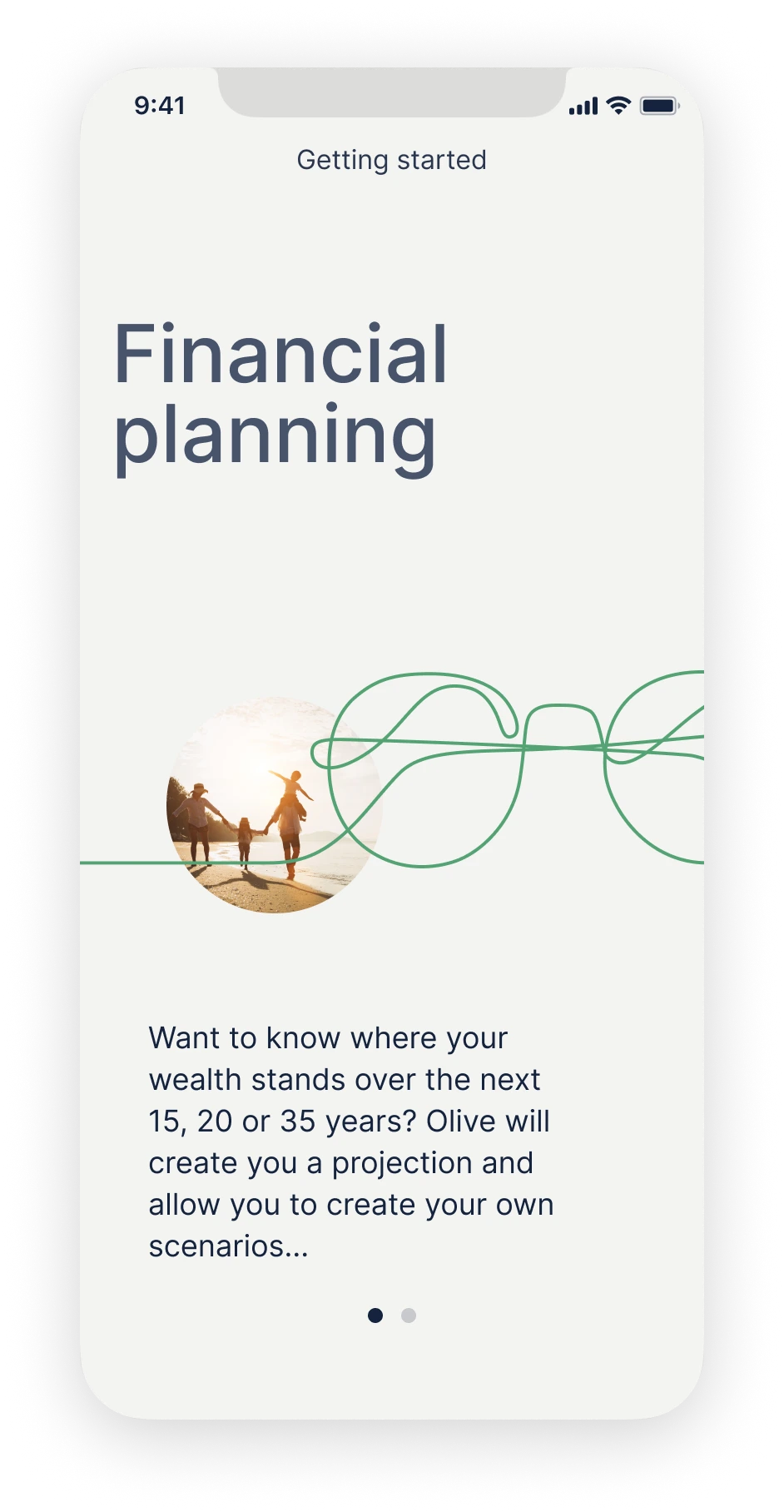
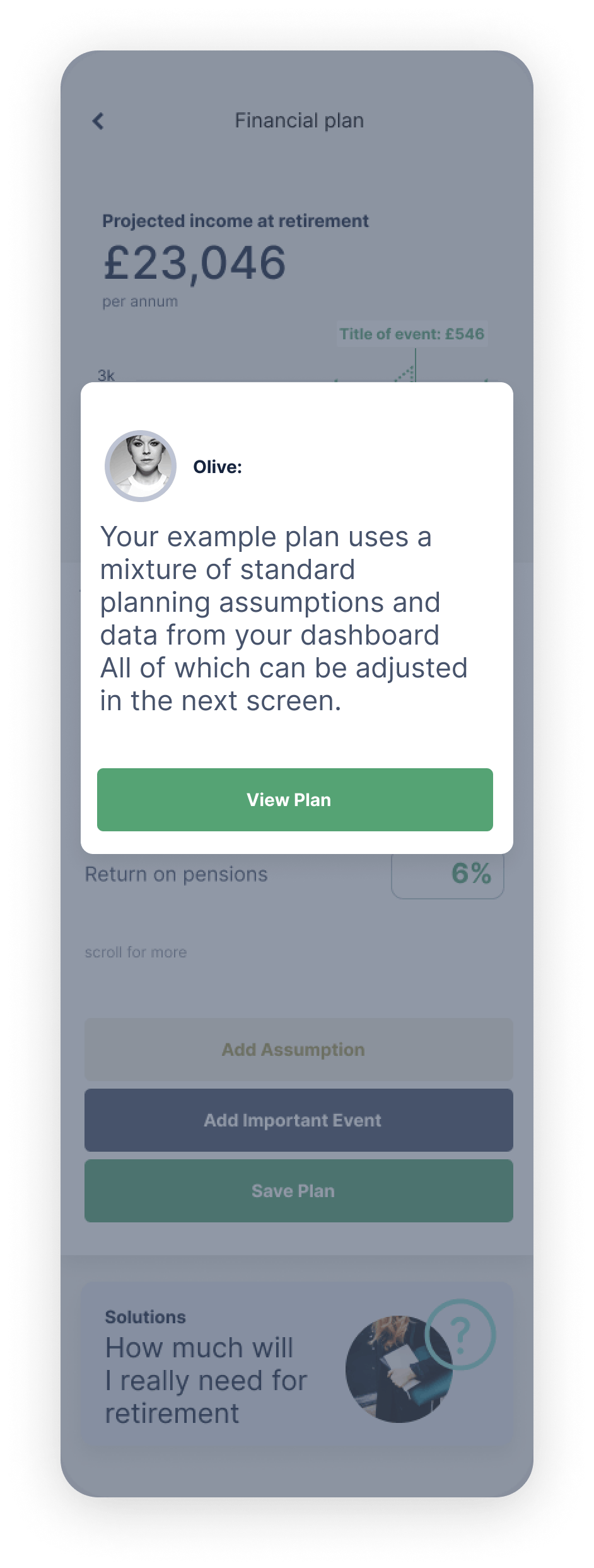
The app’s UI needed to be clean and professional in style while still appealing to consumers. To entice Olive’s key target audience to download the app for themselves, inspiration was drawn from a selection of brands that were popular among the key demographic, including John Lewis, Waitrose and Monzo. Clean and clear typography, with simple line icons and illustration, was used alongside human photography to create a more trustworthy and reassuring experience. Unique features, such as the ability to add an important event to your financial plan, allowed users to personalise their in-app experience. Articles answering key questions the audience might have, including ‘What return am I actually getting from my rental property?’ also enhanced the app prototype, tailoring it perfectly to the users Olive wanted to reach.

5
Five Day Sprint
9
Unique features
38
Screens
The completed prototype needed to include all the key features of the final app in order to capture effective user feedback. This required extensive design and conceptualisation to establish how best to display and input financial data over time, in a clear format, on mobile devices.
See more like this...
The Frames, 201–202, 2nd Floor,
1 Phipp Street, London, EC2A 4PS, UK

Talk to us
Button TextCopyright ©2024 Rhapsody Ltd. All rights reserved.

The Frames, 201–202, 2nd Floor,
1 Phipp Street, London, EC2A 4PS, UK
Copyright ©2024 Rhapsody Ltd. All rights reserved.