Back to Blog
MOKE’s rebranding and new website – a British automotive classic reborn
James Willard - 12 May 2023 - 8 min read

How Rhapsody created an international web and e-commerce solution for an iconic car brand
Launching a new version of an iconic product invariably presents major challenges for a brand. Will the latest version gain as much traction as the original? To what extent will its design and functions change? What visual tools should be used to showcase the new product while staying true to the brand’s DNA? How do you successfully market it to a new generation of consumers? With this in mind, we re-designed the MOKE website for the launch of their electric version of the iconic vehicle.
The MOKE car – the story of an iconic beach buggy in brief
Back in the late 1950s, when Sir Alec Issigonis designed a low-weight all-terrain vehicle for the British Army, no one suspected that this was the birth of one of the most iconic car brands. Over 60 years later, MOKE remains the vehicle of choice across luxury resorts worldwide and a coveted four-wheeler for freedom seekers and adventure lovers. Its lifestyle credentials and open body have made it the perfect choice for a cruise along a sea front or for beach outings with friends. In the years that followed its creation, the vehicle was adored by those in the fields of media and pop culture, as well as by leading art figures. From the late 1960s to the early 1980s, the MOKE Californian and, later, the BMC Portuguese were driven by members of The Beatles and Brigitte Bardot; secret agent James Bond also raced around in a MOKE in some of his films. Despite disappearing from the market in 1993, the brand made a successful comeback 25 years later, becoming the favourite vehicle of surfers.

As the automotive industry faces its biggest technological revolution since the patenting of the internal combustion engine, MOKE is unveiling an electric version of its iconic vehicle. Rhapsody was tasked with the design and implementation of the new product’s website, which needed to be tailored to the demands of present-day consumers.
The starting point to designing a website: understanding the consumer
Brands that have built their reputation over decades need to carry out rebranding carefully and with a clear understanding of the target group. As a brand that has changed its image more than once in over 60 years while always targeting the ever-changing market segments, MOKE was well aware of this.
Rebranding using specific UX/UI tools
We started working on the website with a comprehensive branding strategy that had been designed by the client. At the heart of it were the user personas that had been developed by the brand’s marketing team.

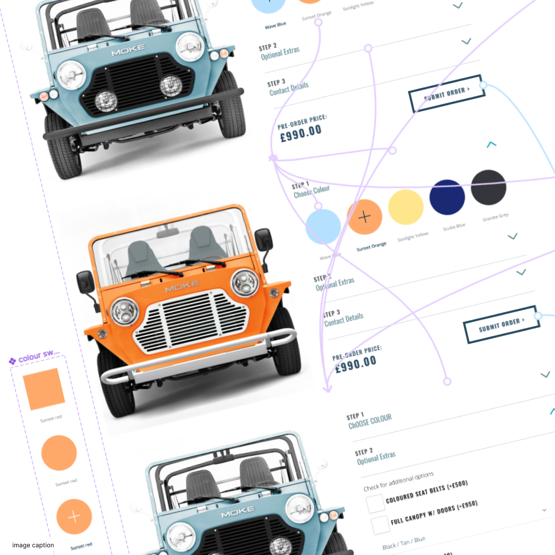
The electric MOKE is targeted at active, modern consumers who consciously choose electric vehicles; not only do they feel at ease navigating digital environments, but they also like to actively spend time at the beach. The website set out to build an attractive image of the electric MOKE, while also facilitating access to important information and offering an online order solution. Our aim was to enable customers to reserve their MOKE by paying a deposit via an easy online payment system. During a creative UX/UI workshop with the client, Rhapsody’s designers developed a site map to establish the key points of contact between the consumer and the offer. This workshop resulted in a detailed buyer journey that showed the step-by-step pathway of the prospect’s purchase.

Designing a visual language with photography, a color palette and a lifestyle vision We selected the color palette, fonts and image style based on the branding guidelines that had been agreed with the client. Guided by the keywords lifestyle, beach life and summer vibe (while bearing in mind the brand identity), we developed a comprehensive visual language for the new product.
These choices were designed to help boost brand recognition, to establish visual consistency and to sit in line with the tastes and expectations of the present-day consumer. This became the starting point for the design work we carried out on the website’s architecture and for the selection of relevant programming technology.
A functional website with a mobile-first approach
When rebranding, even the best-designed strategy will not be successful if the website’s basic functionalities and technology are overlooked. Responsiveness, the mobile friendliness of a platform and website architecture that has been fine-tuned for SEO are all factors that will help attract new audiences.
Buying products on a smartphone has become so natural for most of us that it has become hard to imagine a website that is not mobile-friendly. Because of the changes that search engines have pushed on web developers in recent years, a significant proportion of professional web design now begins with mobile solutions.

Research shows that 89% of today’s consumers are willing to recommend a product following a positive brand experience on mobile devices. A “mobile first” approach not only creates a point of contact with existing buyers, but also becomes an opportunity to win over entirely new consumer groups. This is especially important for brands – like MOKE – that have to redefine their audience.
SEO-friendly solutions on a WordPress-based website
Having a mobile friendly website will never be enough to establish a brand’s position if online visibility is neglected. Online visibility is not simply achieved through a noticeable rebrand: it also requires tailored and well-thought-out SEO activities. These lead the consumer from their first search engine query (sometimes with a well-positioned adwords ad) to the purchase form, via the website’s clear, user-friendly content.
Adopting these basic rules will not only make the product visible on the web and engrave it on potential prospects’ minds, but will also make the product stand out against those of competitors or, as has happened with the iconic Mini Moke, sub-standard imitations.
In order to provide MOKE with flexibility, maximise the brand’s SEO footprint and allow its team to manage content more easily, we opted for the responsive and intuitive WordPress CMS as the development platform.
A functional and multi-language platform
Besides allowing for easy content management and its powerful SEO optimization capabilities, WordPress has yet another important advantage: it allows for the preparation and merging of multiple language versions into one universal platform, which can then be managed by people from specific markets or departments. For the project with MOKE, this was all the more important because the car was to be extensively marketed in the UK, France and the USA. By adopting a multi-language approach, we not only helped minimise the client’s expenses for development, but also consolidated the entire promotional campaign within a single site.
An e-commerce platform that elevates sales
Customers should always be able to navigate smoothly from reading about a product to buying it. It must be an intuitive and seamless experience with positive associations. When seeking to attract clients with a new car model, the key functionalities of e-commerce should include:
- an online car configurator,
- online orders,
- online payments.
These elements create a complete digital buying process based on emotions. Who wouldn’t want to customise their own dream four-wheeler? Not only that: they will also want to order and pay for it in just a few clicks while having the freedom to do so from any location, without having to make a showroom appointment. Understanding these consumer needs is of great importance, so that a brand can be adequately prepared to meet them.

To meet MOKE’s needs, we integrated Stripe (online payments) with WordPress (online car configurator). This allowed us to present the product in line with the brand’s strategy and it also gave MOKE the means to process individual payments. We also synchronised the entire system with Salesforce (online orders), enabling the brand to track customer orders and provide personalized offers in the future.
A MOKE fan can therefore fulfil their dream of selecting and purchasing one of the brand’s coveted vehicles quickly and easily, before embarking on their next summer adventure.
A website design tailored to consumer needs and expectations
Understanding the expectations of consumers is just one piece of the puzzle. You also need attractive design and photography, combined with a functional and easy-to-use e-commerce site. This is how you stand out in the marketplace and achieve brand longevity, especially when you’re tackling new challenges.
If you’re looking to build a group of loyal customers for your new product, you need to prove to them that the product is continuously changing alongside them and being adapted according to their ever-evolving needs. Let’s face it, in this day and age, you’re only going to be able to prove the point if your brand’s activities and communication efforts are optimized for search engines. Accessibility and a mobile-first approach should therefore always be the starting point in digital media.
Would you like to find out what web services we can provide for your brand? Schedule a free meeting with our team and let’s discuss the possibilities.
You might also like...
Get the email newsletter and unlock access to members-only content and events.
The Frames, 201–202, 2nd Floor,
1 Phipp Street, London, EC2A 4PS, UK

Talk to us
Button TextCopyright ©2024 Rhapsody Ltd. All rights reserved.

The Frames, 201–202, 2nd Floor,
1 Phipp Street, London, EC2A 4PS, UK

Copyright ©2024 Rhapsody Ltd. All rights reserved.
